Result View Layout in MediaPortal
The Result View Layout functional use case category, users will be presented with a list of use case pages. Each of these pages is dedicated to providing the configuration options for views available in MediaPortal.
Table, Card and Grid Default Views
Selecting any of these pages will open the current layout for each of views and allow for users to specify which metadata fields are expressed.
It is important to note that the layouts are, by design, not the same, users will not be able to manipulate the layout, only which fields are expressed.
Table Views
The table view will be the same configuration across all users and has no option to differentiate for object types or groups, this all objects are shown in the same table.
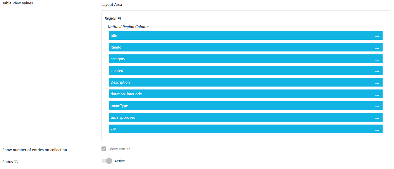
A user can select to not show specific columns or re-order them directly in the MediaPortal where it will be persisted.
An administrator can define, if the number of entries on a collection is displayed or not.
Additional options to adjust the layout for the table view can be done via
User Label: Overwrites the label in that particular context
Show text in Bold: Makes the label and value bold
Min Width(px) / Max Width(px): Sets a different size to the columns
Card View
The Card View area defines, which card layout is used as fallback, if no other custom card has been configured.
Card View Custom
Differentiate the views by
Media Type / Collection Type
Category (Single Metadata to differentiate e.g. Departments)
User Groups
Depending on the combination of attributes the corresponding view will be shown. So a Media Manager from the Sports department, can have a different view on Images than a Producer from a feature department.
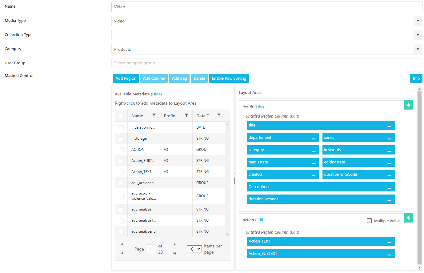
The MediaType and Collection Type do not work in combination. The Administrator has to pick one of them.
→
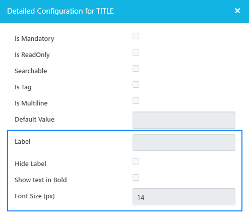
Additional options to adjust the layout for the cards can be done via
Label: Overwrites the label in that particular context
Hide Label: Only shows the value of a field
Show text in Bold: Makes the label and value bold
Font Size (px): Sets a different font size to highlight text
Grid View
The Grid View area defines, which card layout is used as fallback, if no other custom card has been configured.
Grid View Custom
Differentiate the views by
Media Type / Collection Type
Category (Single Metadata to differentiate e.g. Departments)
User Groups
Depending on the combination of attributes the corresponding view will be shown. So a Media Manager from the Sports department, can have a different view on Images than a Producer from a feature department.
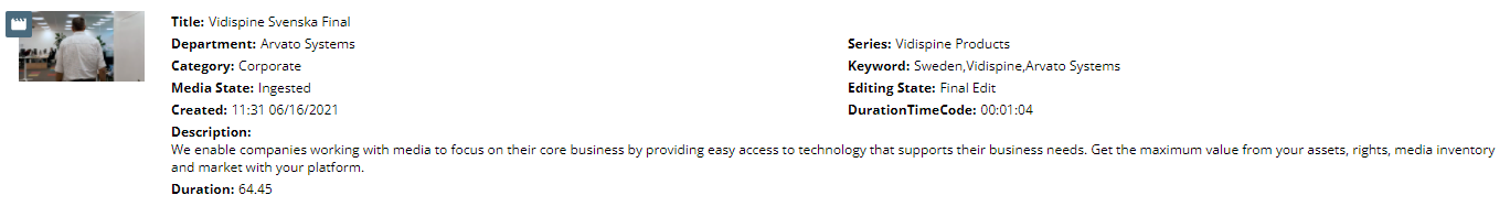
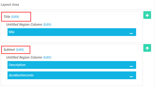
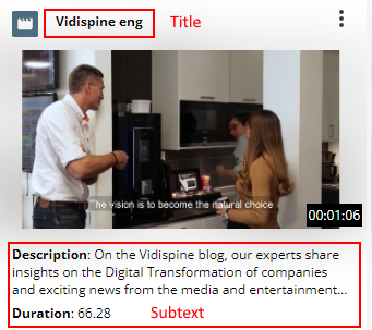
Title - Defines what is displayed on top of the card
SubText - Defines the text below the thumbnail
Custom Icons
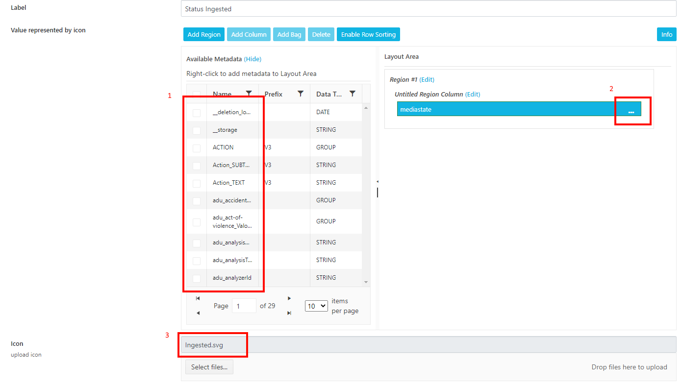
Users can upload custom icons into ConfigPortal and have these specified for specific metadata fields in search results.
Example: Uploading an icon to represent the upload status of an item.
Once in the Field Icon page:
Select a metadata field
Select value which should be represented by icon
Upload SVG
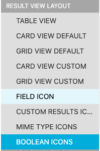
Set an icon for string or dropdown fields in the “FIELD ICON“ configuration or for a boolean in “BOOLEAN ICONS“.
Custom Thumbnails
It is possible to upload custom thumbnails for items or collections. An Administrator can differentiate between Item-type, Collection-type or a Category metadata field.
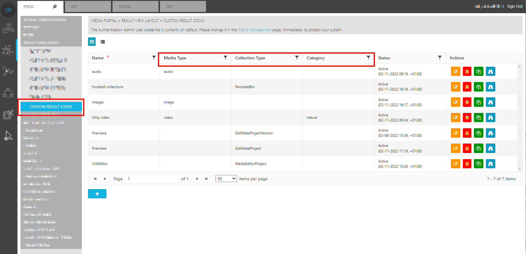
Example: A custom icon is shown for example for audio
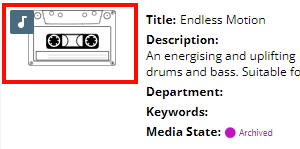
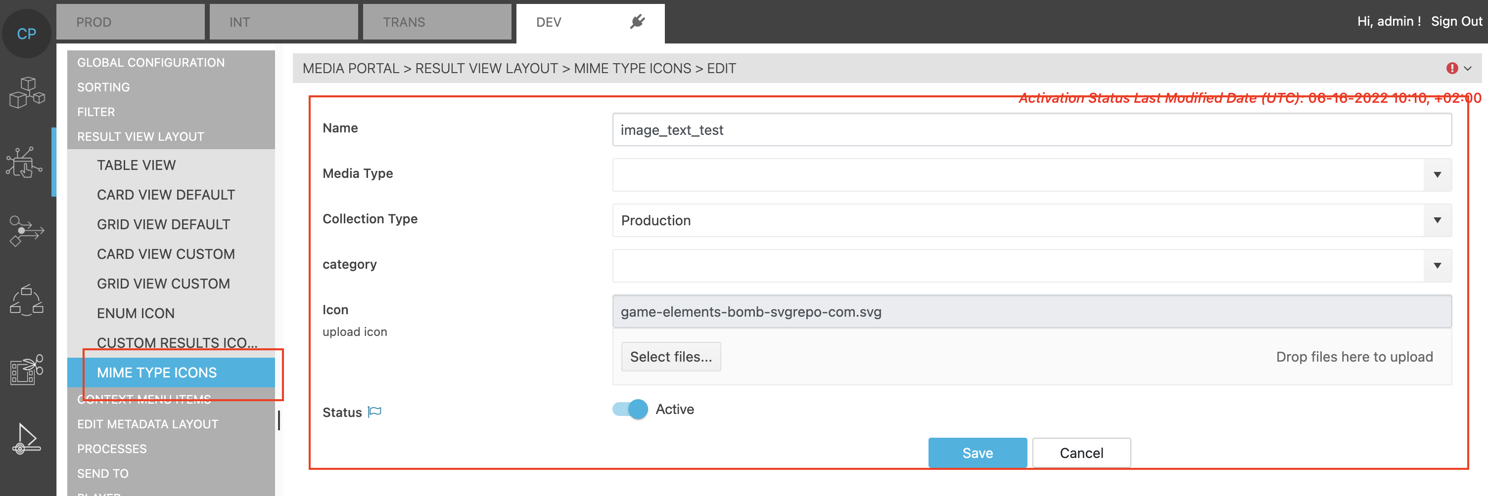
Custom MimeType
It is possible to upload a custom Icon for MimeTypes. An administrator can differentiate between Item-type, Collection-type or a Category metadata field.
Example: A custom MimeType is shown on the top left of a result icon.